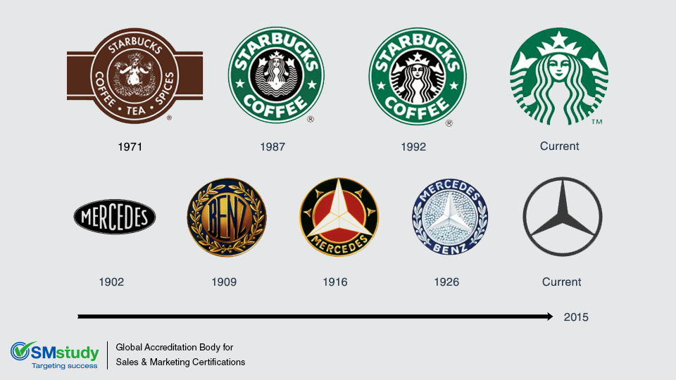
Walk through any airport and you’ll experience the power of logo. Starbucks’ green siren beckons from down the terminal, easily recognized 200 yards away. Cinnabon’s royal blue ribbon assures you there’s a tasty treat waiting for you. McDonald’s, Burger King, TGIF, Chili’s—you know them. All have risen to the top of the logo ecosystem, known and understood by consumers across the country and often around the globe.
Communicating the “right” message via a logo is of critical importance throughout the life of any company. According to theSMstudy® Guide, “This image communicates the promise of value the customer will receive from [their] product or products.” A logo becomes the most recognizable symbol of a company or brand and ideally should be unique, adaptable, timeless and appropriate. These four characteristics identified by Inc. are considered essential for a great logo.
Having a unique logo is essential for companies or brands to be easily identifiable in the vast consumer marketplace, such as in the airport terminal scenario above. So when it comes to logo updates and changes, Business Insider reminds us that the process is a delicate one and that certain qualities must remain constant.
Business Insider’s Jason Nazar says, “Every brand hopes to elicit from its logo (a sense of) fondness and comfort with a touch of excitement. Every logo must walk the fine line between nostalgia and modernity; you want to remain your lovable self, while staying current.”
With all these factors to consider, logo evolution can become a dicey affair. But as Inc. points out, logo adaptability and appropriateness allow for, and indeed require, revamping from time to time. Many companies are willing to risk the public backlash—an ever-lurking possibility—and make changes for the sake of keeping up with customer tastes.
Companies have tackled the problem of keeping logos “lovable” but also making them “current” in various ways. Some companies have adopted a gradual design evolution approach while others have opted for more dramatic transformation.
One of the logo success stories that’s made gradual design iterations to reflect the changing tastes of customers over the years is the coffee giant Starbucks. Since its founding in 1971, Starbucks has evolved its logo to project a modern aesthetic yet keep its most memorable elements.

No comments:
Post a Comment